

JEWELLERY PARTY
WEEK 3 PROTEST POSTERS
Destiny rescue is a non-profit organisation that aims to rescue children from slavery and end trafficking and exploitation. Options for support range from donations and sponsors to events such as jewellery parties, where young girls saved from slavery and exploitation are taught to make jewellery that goes into jewellery parties for people to purchase. This not only saves the girls, but also gives them a way of life.
https://www.destinyrescue.org.au/

FROM THIS TO THIS
TECHNIQUE: Juxtaposition and shock value to draw empathy. Graphite and colour pencil
PROCESS: First of all, I researched what the organisation offers and their aims. From there I brainstormed forms such as jewellery and hands and how i could communicate pain. Once I landed on the hand tightly grabbing another juxtaposed with the hand with a bracelet i moved over into layout. I then noticed that the logo is greys and orange so i decided to add orange to emphasise certain parts of the design.
REFLECTION: Although I am happy with the hand designs and the idea behind the drawing, I am not happy with the layout and I was not sure on how to improve it. I really like the touch of colour and how that ties in with the organisation as i think its important to ensure the design fits with the companies current style.
#oneperday2020

CLOSING THE DOOR
TECHNIQUE: Mainly shock value to draw empathy and fear. Graphite and colour pencil
PROCESS: Since I wanted to create a sense of fear and tension, I decided to draw a dark figure standing over a child. In the first design however, I had made the door frame too small and wanted to make slight adjustments on the layout. The right image is where I looked into paths and leading the eyes a certain way. For this I made the door frame more to the right sight of the poster so that the shadow could lead the eyes towards the relay text. After this is went in with my pencil and darkened the figure behind the girl by layering the pigment.
REFLECTION: Most of all I am happy with the theory behind the image by incorporating leading lines and perspective. By placing the girl under the horizon line it means the viewers look down on her, like the exploiters would. The figure is then above the horizon line, as if looking down on the viewers, just as they would on the girls they enslave. I spent a fair amount of time in the theory of the layout and less on the actual design, resulting in a very simplistic design which I do like, but I would prefer some more of my style to influence.
#oneperday2020
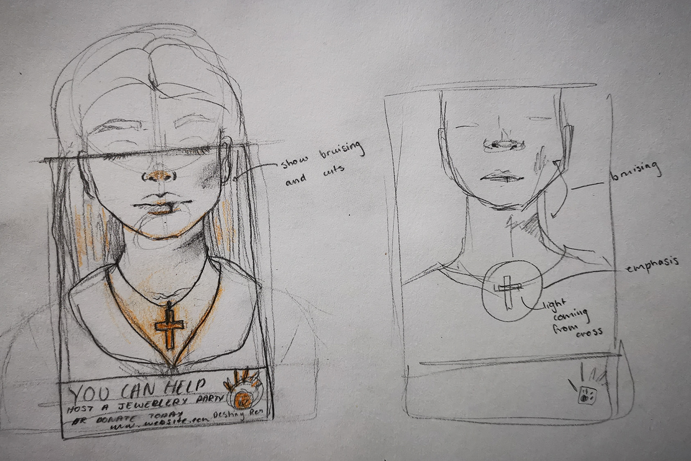
YOU CAN HELP
TECHNIQUE: Creating demand from the viewer. Graphite and colour pencil
PROCESS: From the first sketch, I drew jewellery, so I decided to incorporate jewellery again. On the right is my quick idea sketch that took a couple of minutes to draw. I the went on to refine the sketch. Firstly I lightly sketched a face and upper body of a young girl. I then went in with a heavier pencil and drew the dimensions of the poster and defined the lines within the rectangle, Afterwards I used the orange pencil to make the necklace appear as if it was glowing. Lastly, I drew the logo and text quickly.
REFLECTION: Years ago I went to a jewellery party hosted by a friend, and I remember seeing many cross pendents and I still own one my mother bought me. This memory inspired me to illustrate the power of the necklace made. This was shown through the colour. I only used orange on the cross and added surrounding shadows so that it appeared to be glowing. By purchasing the jewellery made by the girls, each piece bought gives them a way of life, where they can work to earn money to pay for food and shelter, so they are not only being saved, but also shown how to create and living and earn money. Overall, this is my favourite design as it was inspired by my own memory.
#oneperday2020
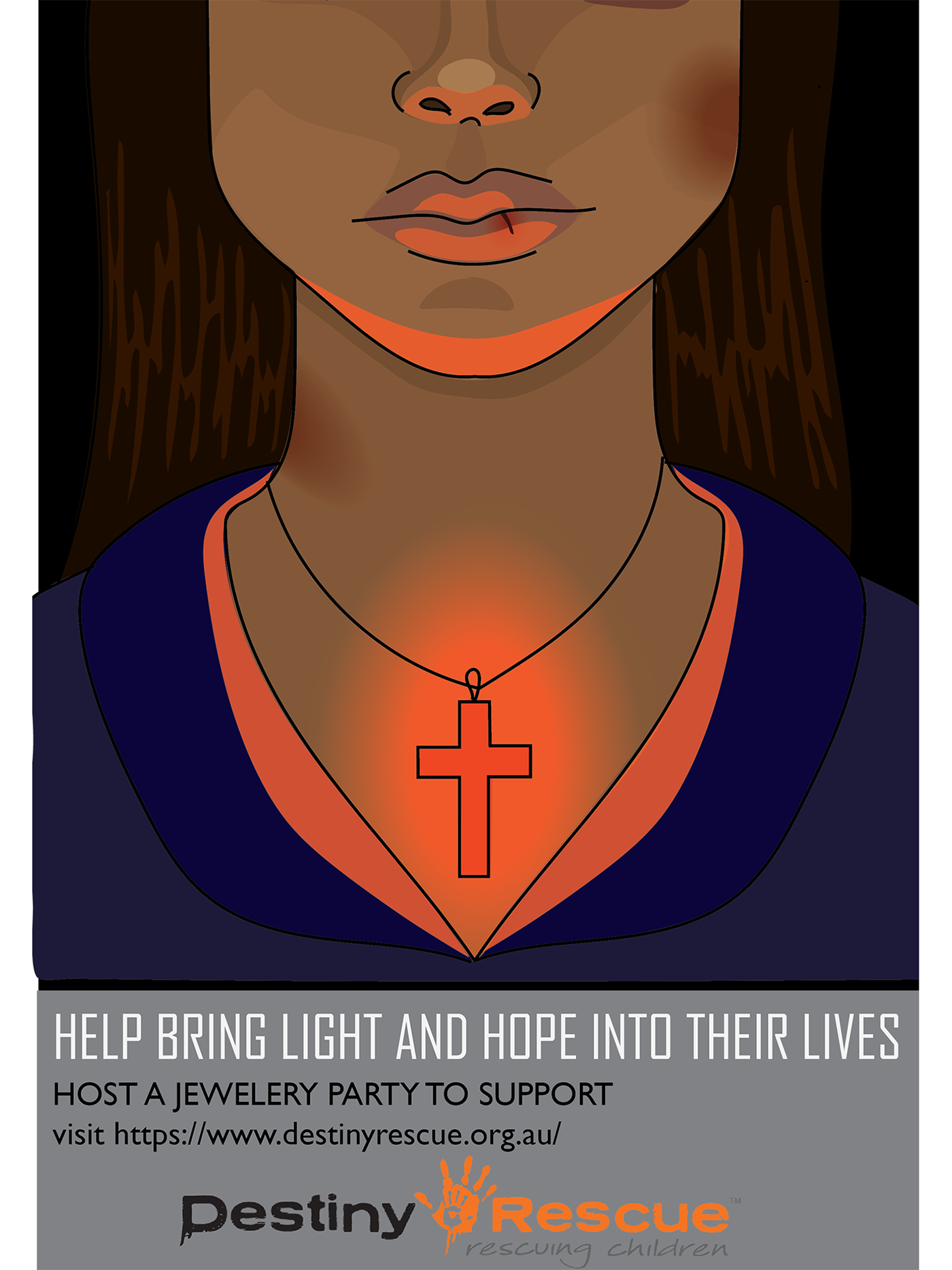
LIGHT (FULL COLOUR)
TECHNIQUE: Creating demand. Illustrator
PROCESS: The first step I took in creating this illustration was by taking a photo of my sketch and then putting it into illustrator. I then used the brush tool to draw the outline of the girl. Layers were then added so that I could then create shapes underneath the outline used the pencil tool. Once all the shapes were drawn, I used the gradient tool around the necklace and on the bruises on the face and neck. Lastly I created orange highlights by again using the pencil tool, but also adjusting the opacity. To create the banner across the bottom I drew a rectangle and placed in the logo and text.
REFLECTION: Although I am happy with the hand designs and the idea behind the drawing, I am not happy with the layout and I was not sure on how to improve it. I really like the touch of colour and how that ties in with the organisation as i think its important to ensure the design fits with the companies current style.
#oneperday2020


LIGHT (COLOUR VARIATIONS)
TECHNIQUE: Creating demand. Illustrator
PROCESS: Both images are just alterations of the full colour design so the only steps taken to create these was recolouring. To do this, I selected everything then pressed the recolour option and made the image monochrome grey, excluding orange on the left image and making orange the lightest on the right image. After this a few colour changes had to be mad to make sure the shading was still correct.
REFLECTION: I am not completely sure which variation is my favourite as I believe they all communicate the same concept in any colour. Creating these posters really helped improve my illustrator skills and were a really enjoyable experience
#oneperday2020


